Resilient, Edible Perennials for the Western Gardener
Native Foods Nursery is a Oregon-based mail-order plant nursery specializing in species which are both edible and native to the western United States. As such, they must appeal to two niche groups — native plant enthusiasts and edible gardeners — and communicate the value of offering plants that are both edible and native at once. The nursery business is subject to high customer loyalty and competition from large, well established brands, and NFN is competing on quality of product and service — not price or selection.
They need a logo that communicates the precise nature of their unique product selection and a brand that exudes the credibility and professionalism of an established company, while echoing their roots in the more alternative spectrum of gardening and landscape design — natives, edibles, sustainability, permaculture, and the triple bottom line. Keyword research indicated that the market is comprised largely of middle aged woman with expendable income.


After exploring various logomark concepts — ranging from an emphasis on colorful fruit cornucopias to abstract representations of the niche-synthesis concept — we arrived at the bitten leaf and fork. Tilted slightly for a sense of playfulness, it joins the figure of perennial plant foliage with a universally recognizable symbol of edibility — the fork — into a single image, and the bite mark gives it a feeling of deliciousness.
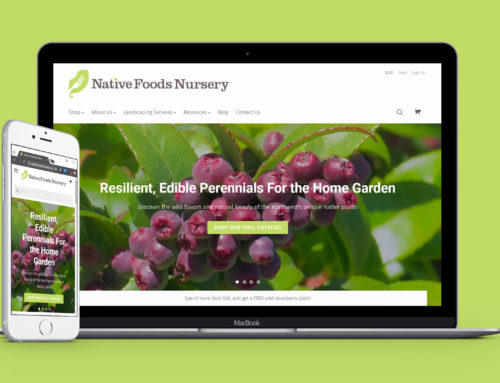
After the creation of the brand identity, we moved onto the creation of the online store, which needed to be reliable, feature rich, and easy to manage. I was tasked with evaluating all of the available solutions and choosing the appropriate combination of technologies. In the end, we decided to use the Bigcommerce, and I managed the construction, design, and content creation processes.

NFN ships living plants all over the country, and to ensure the good care of the plant and a joyful experience for the customer, they use beautifully and carefully constructed packaging to do so, reflecting the company’s values through it’s quality as well as its sustainable sourcing. Their physical packaging is one of the primary ambassadors of their brand, so naturally it needs to reflect it with consistency and attention to detail. We produced a range of printed assets for this purpose including labels, instruction cards, and stamps.
This project included market research, marketing consultation, brand identity design, logo design, eCommerce website design and development, and packaging and print asset creation.